Larkfire
Wild Water for Whisky
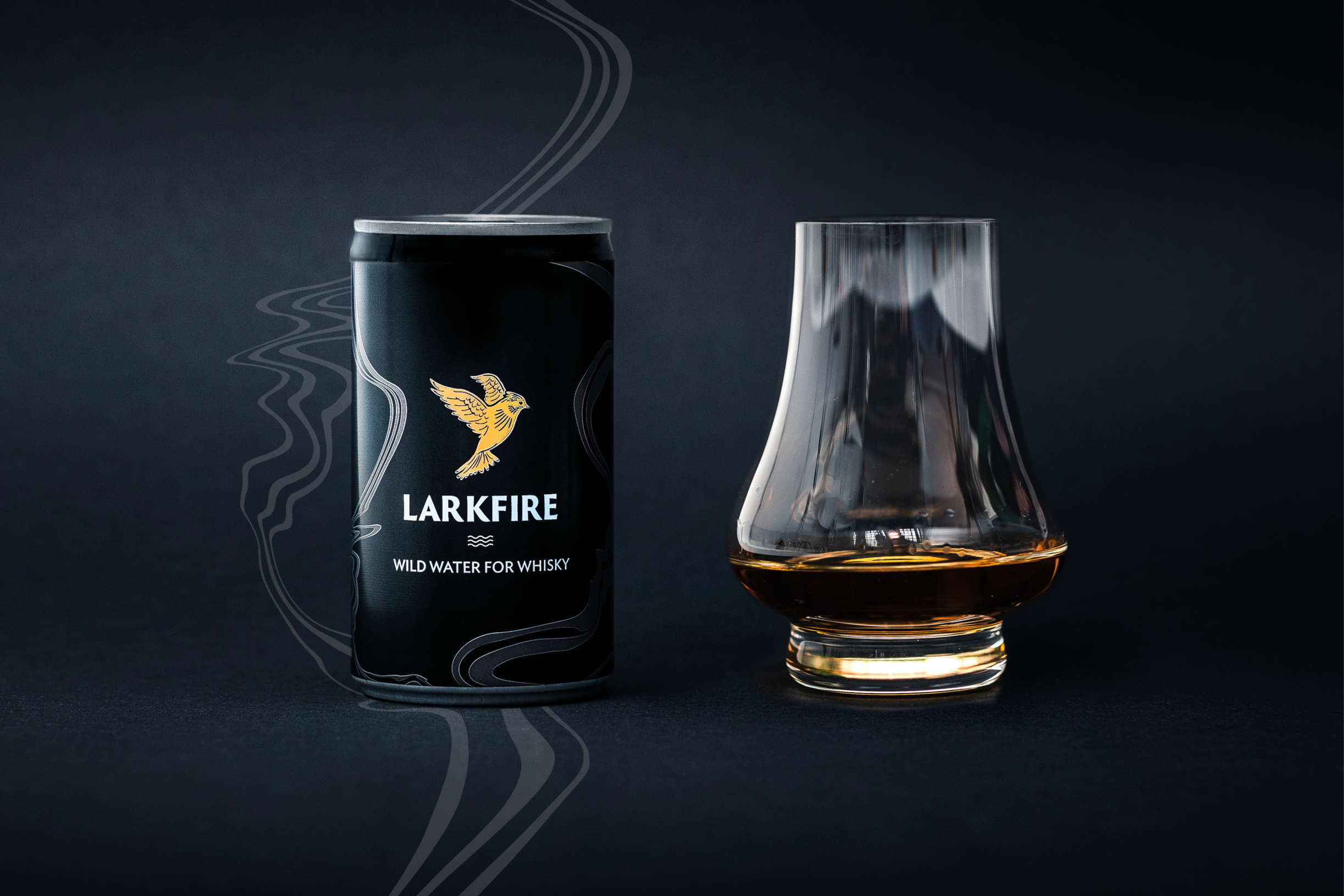
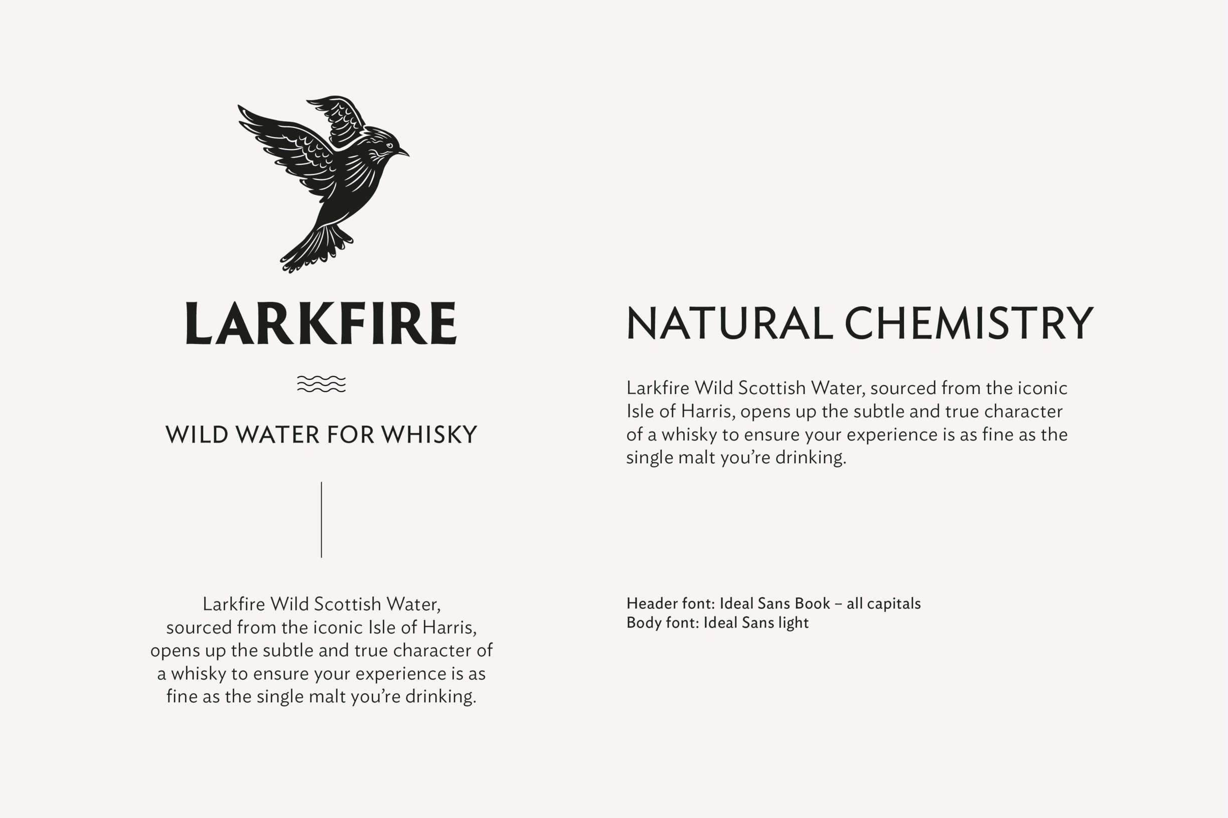
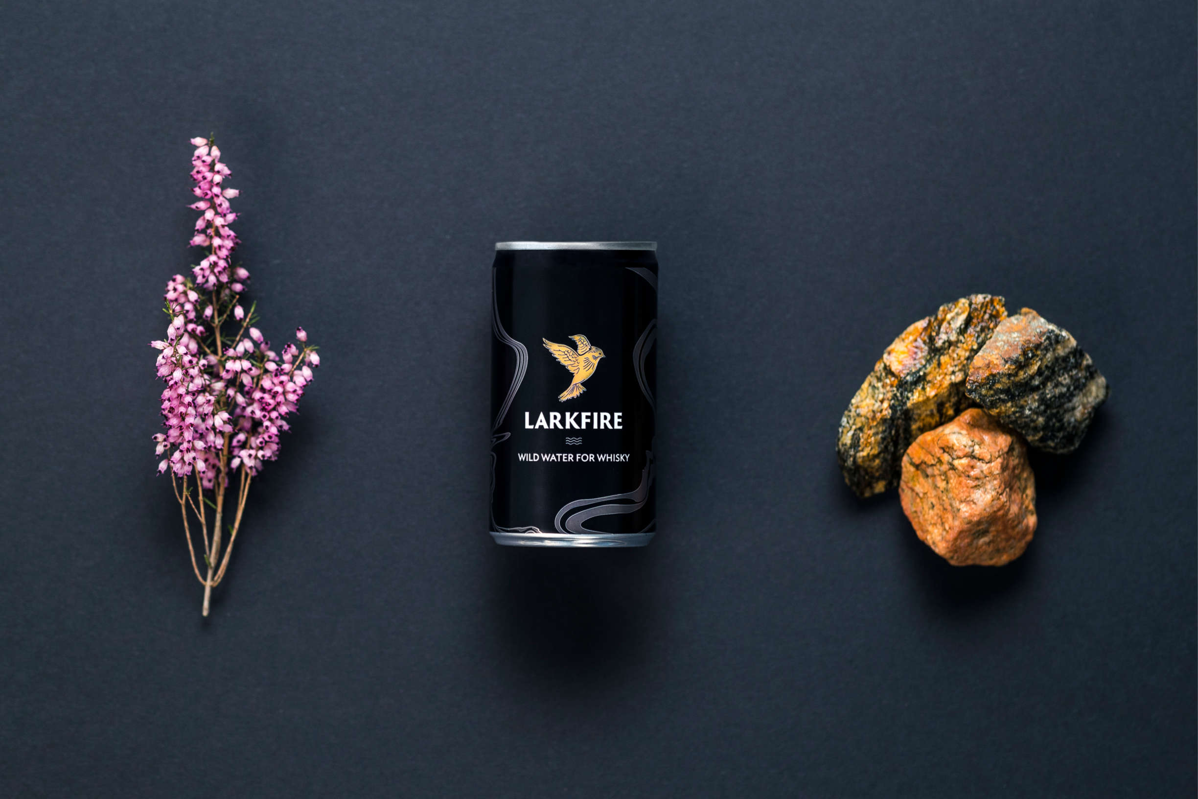
Working in collaboration with Chris from Breadwinner, my brief was to create a suite of brand assets that comfortably sat with Larkfire’s existing logo.
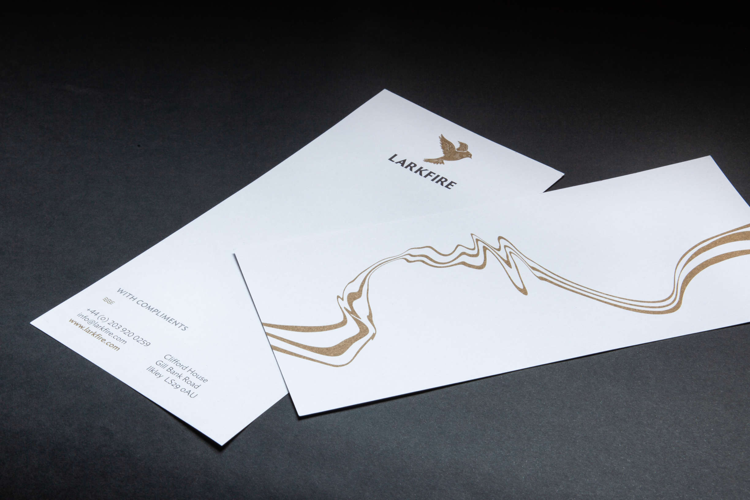
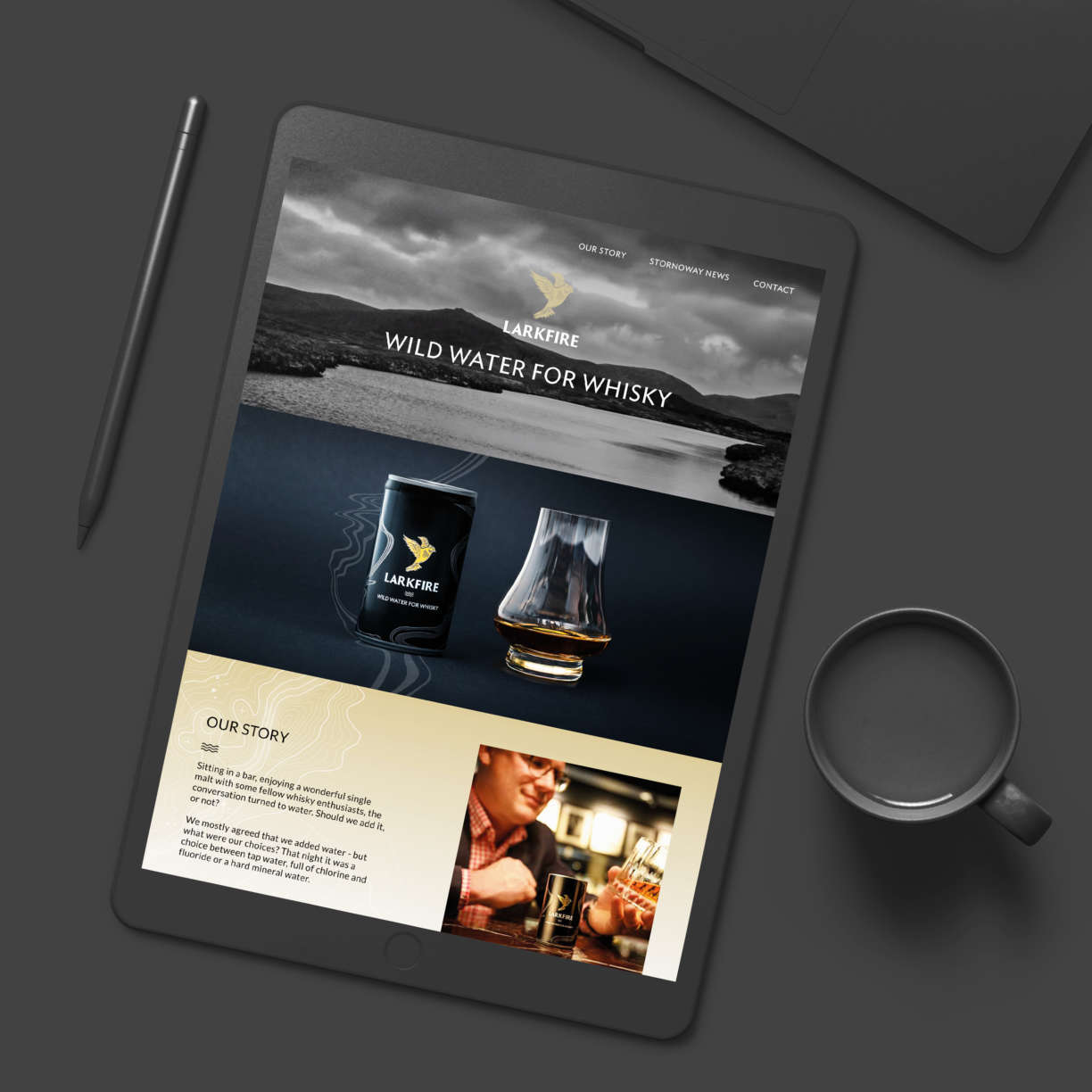
The deliverables included aluminium 150ml can graphics, 4 x 150ml wrapper, shelf-ready packaging, web site layout, stationery suite and brand asset guidelines.
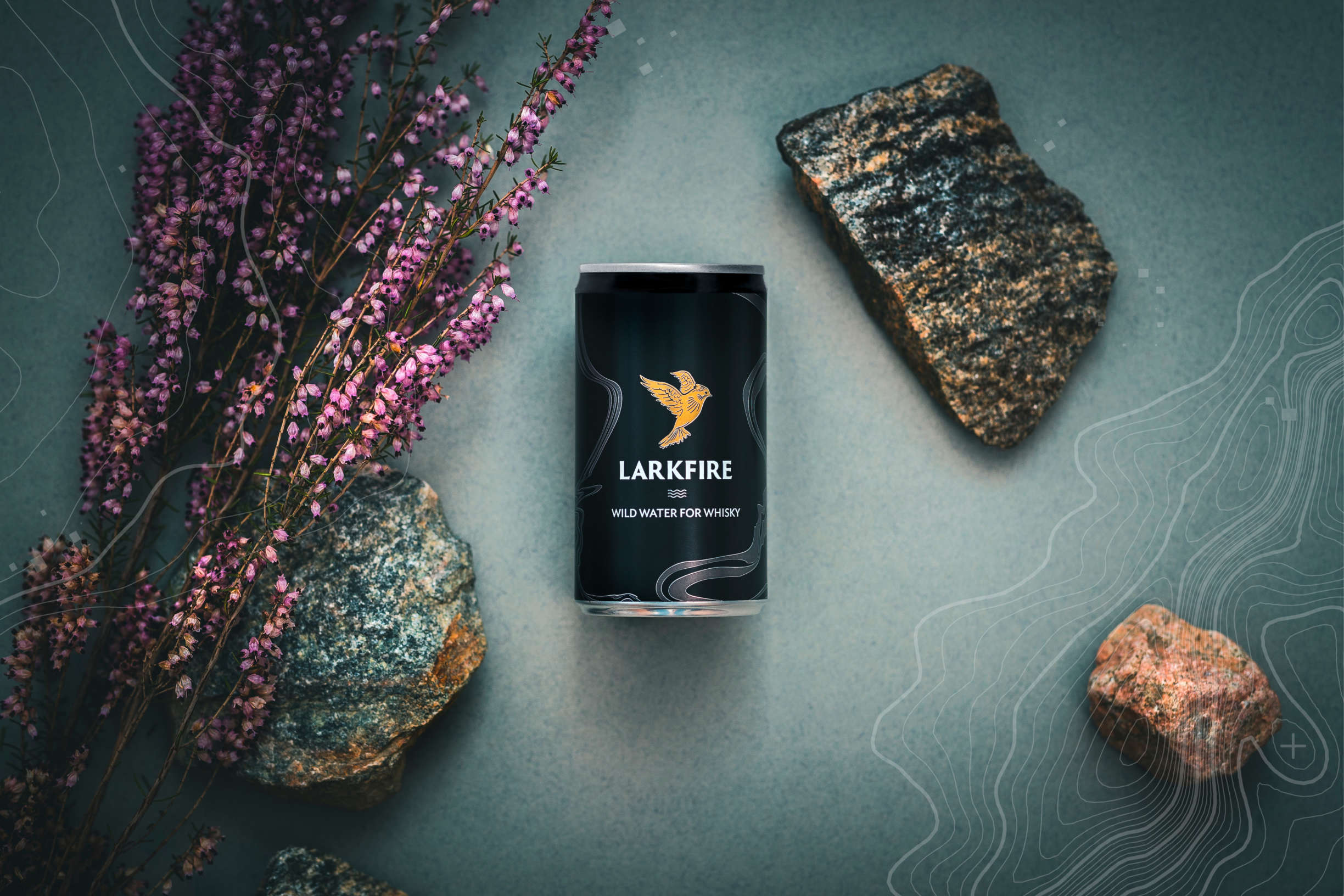
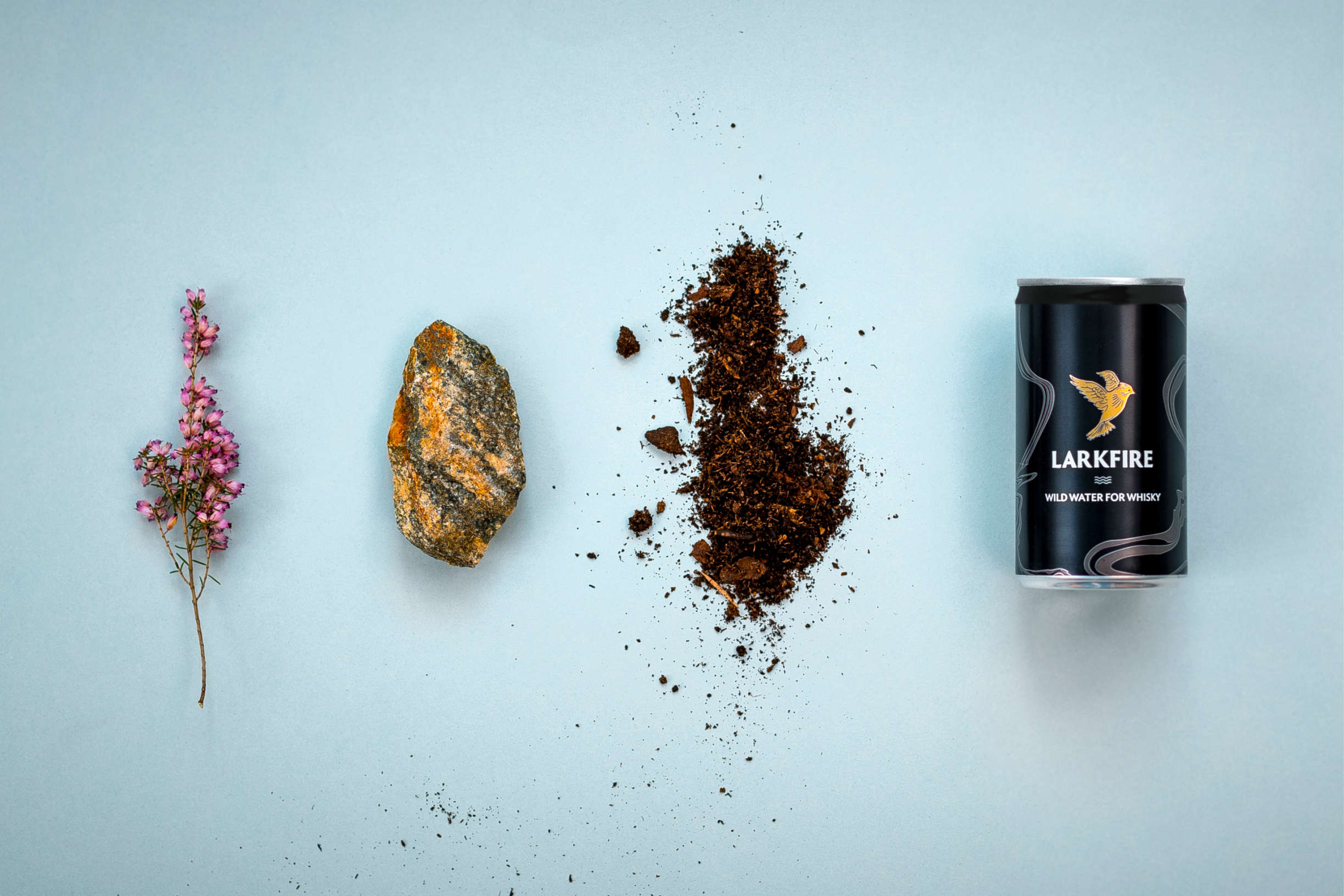
Larkfire’s unique selling point is the location and topography of the Isle of Lewis. Lewis is made up of some of the oldest and hardest rock in the world, Lewisian gneiss. The rock is so hard the water picks up virtually no minerals on its journey to the lochs, where the water is canned at source.
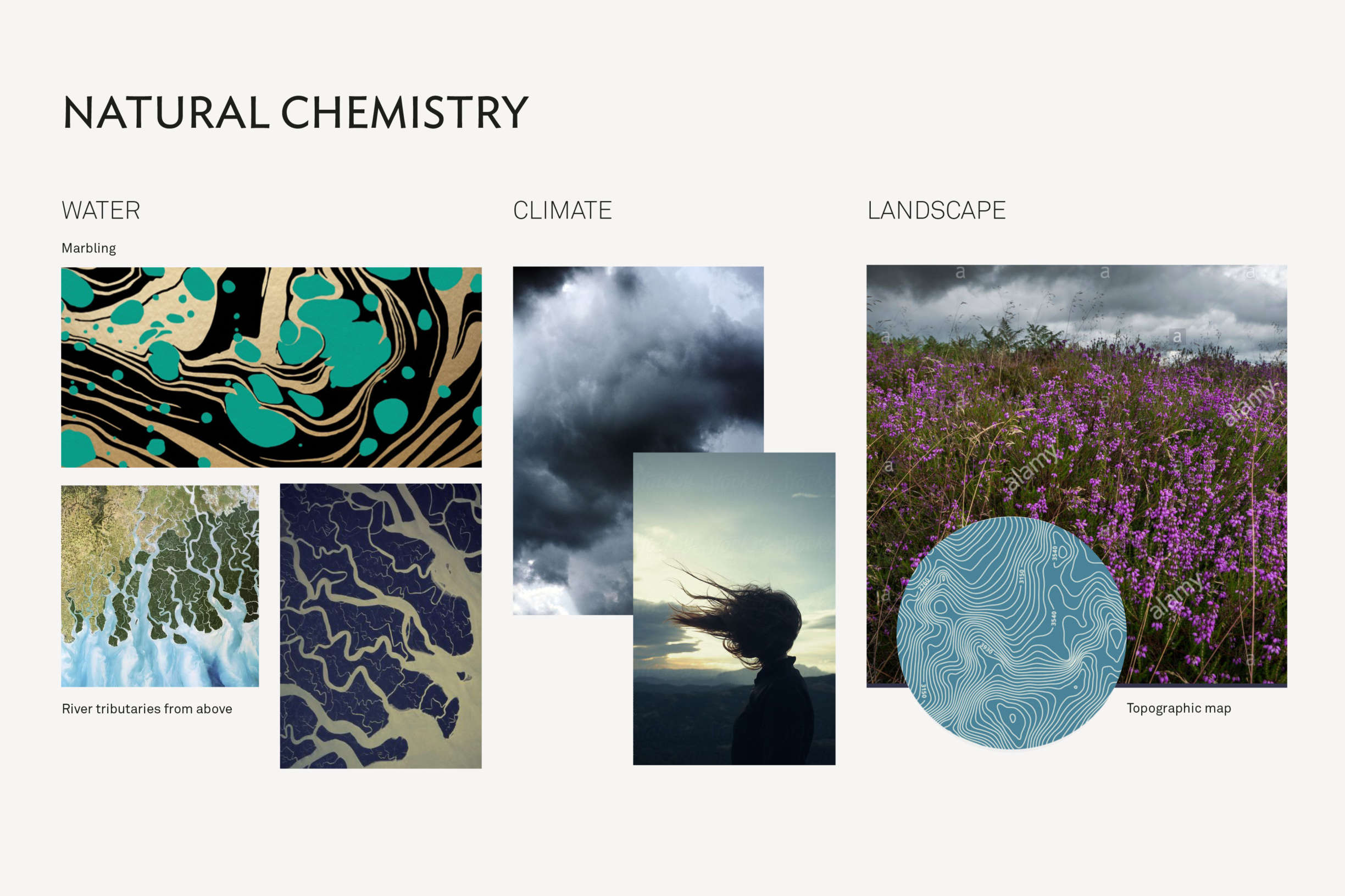
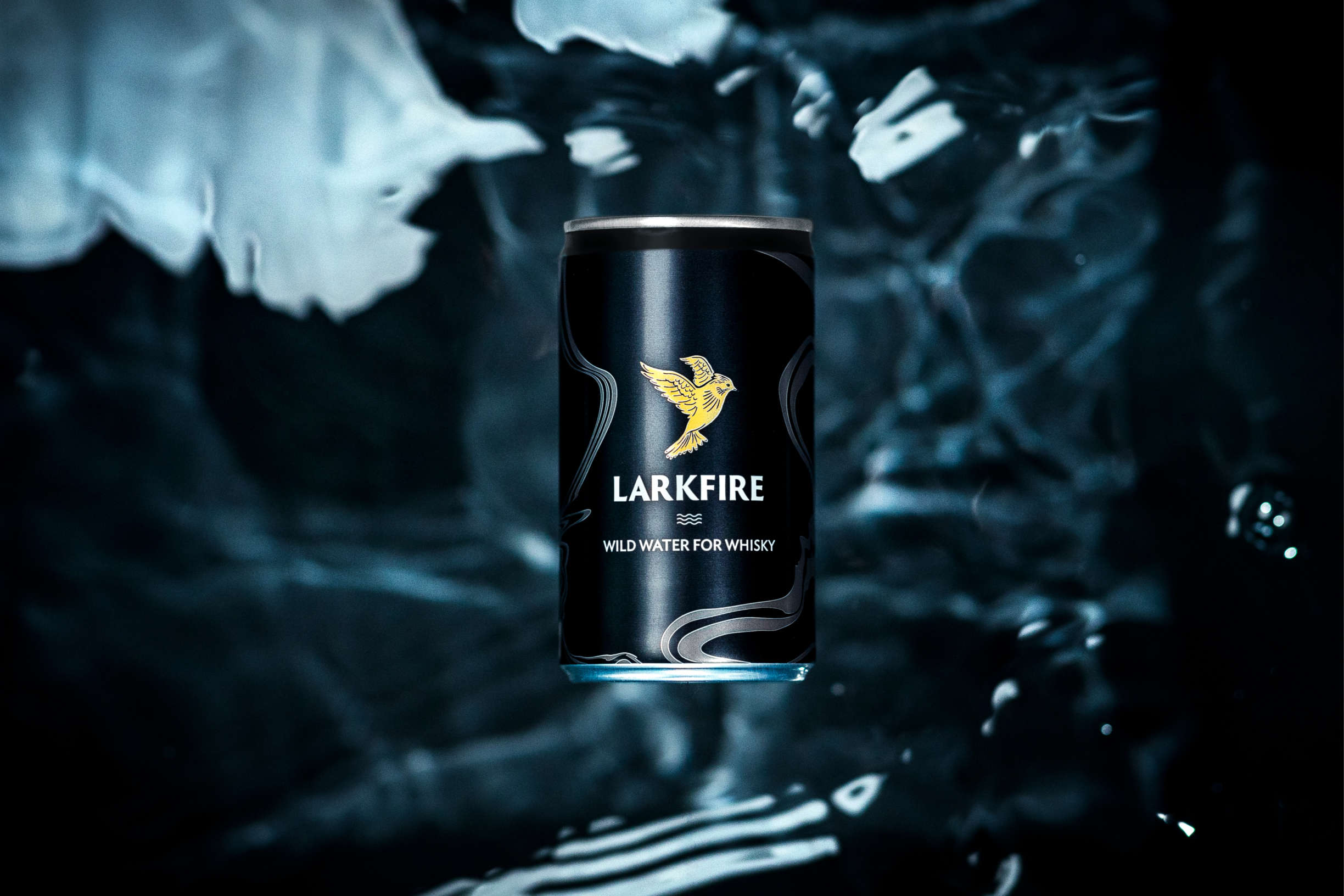
Organic water patterns accompanied by topographic contour maps became the basis for the graphic assets.
Photographer: Will Stanley
Art direction: Anna Cleary
