Ping Pong Fight Club
Let Battle Commence!
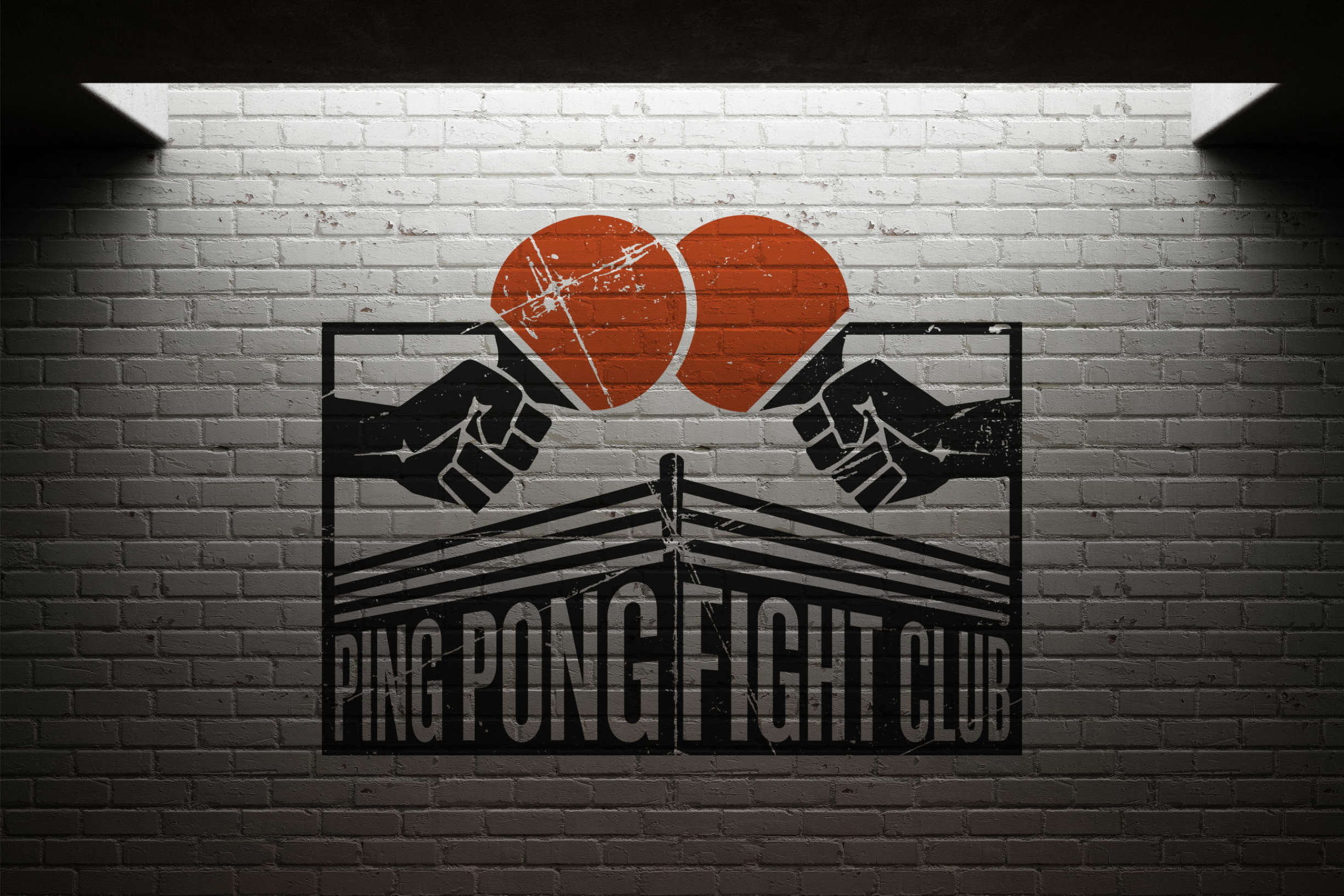
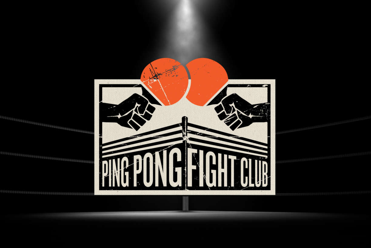
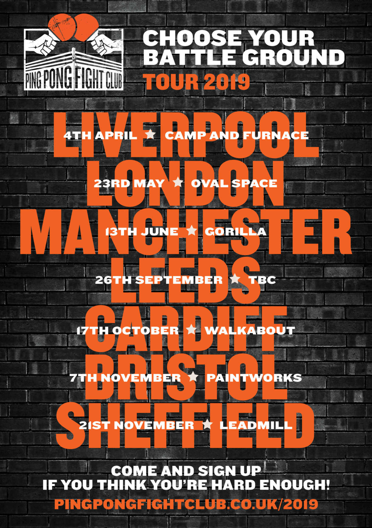
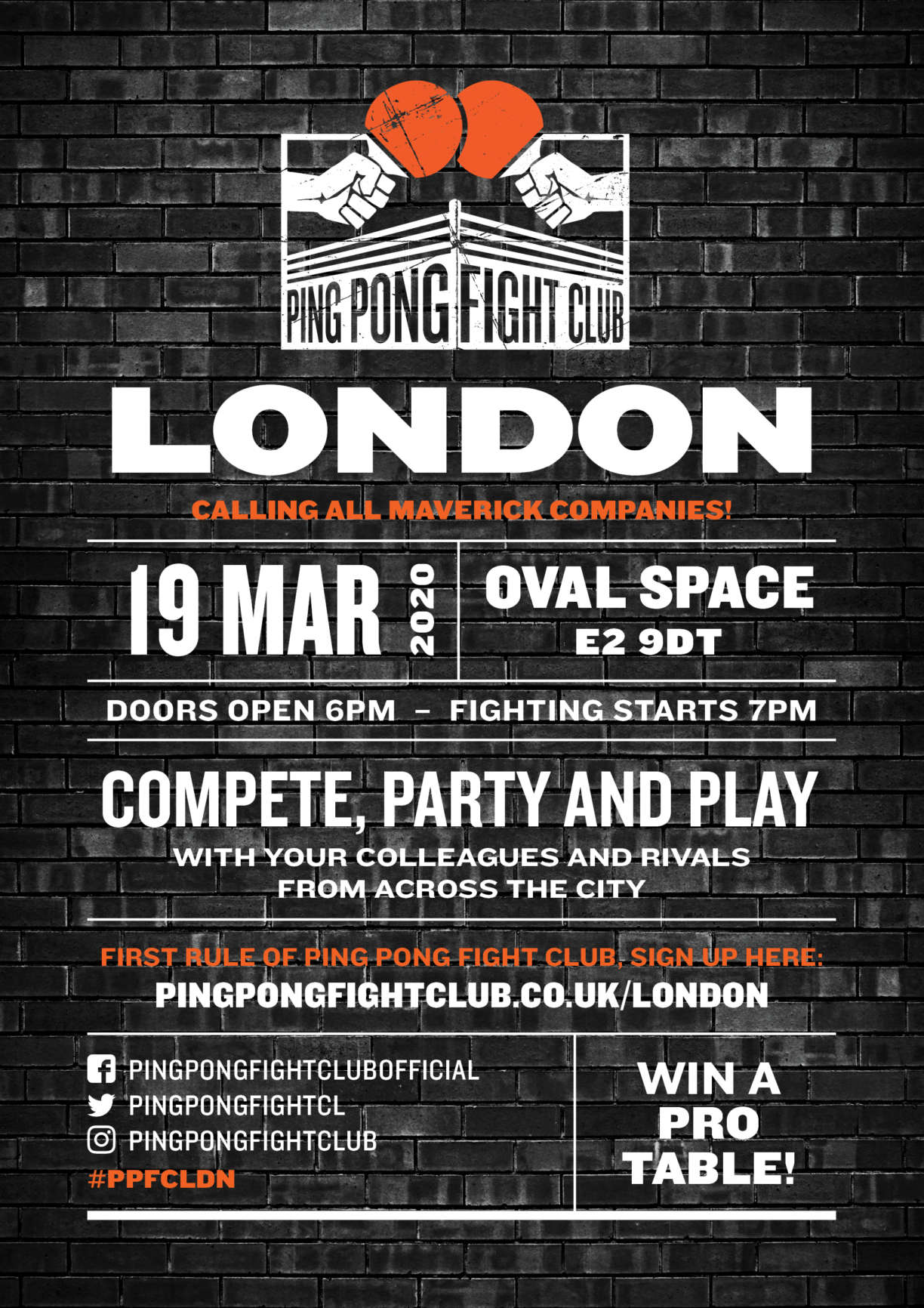
Pongathon approached me to design a logo mark and identity system for their inter-company table tennis tournament, Ping Pong Fight Club (PPFC). PPFC attracts local companies who are looking to engage, bond and motivate their employees, with a side order of networking to boot. Not open to the general public, PPFC tours Britain appearing at industrial or historical venues, warehouses, mills or fine examples of Victorian architecture – these style of venues help to reinforce their brand identity.
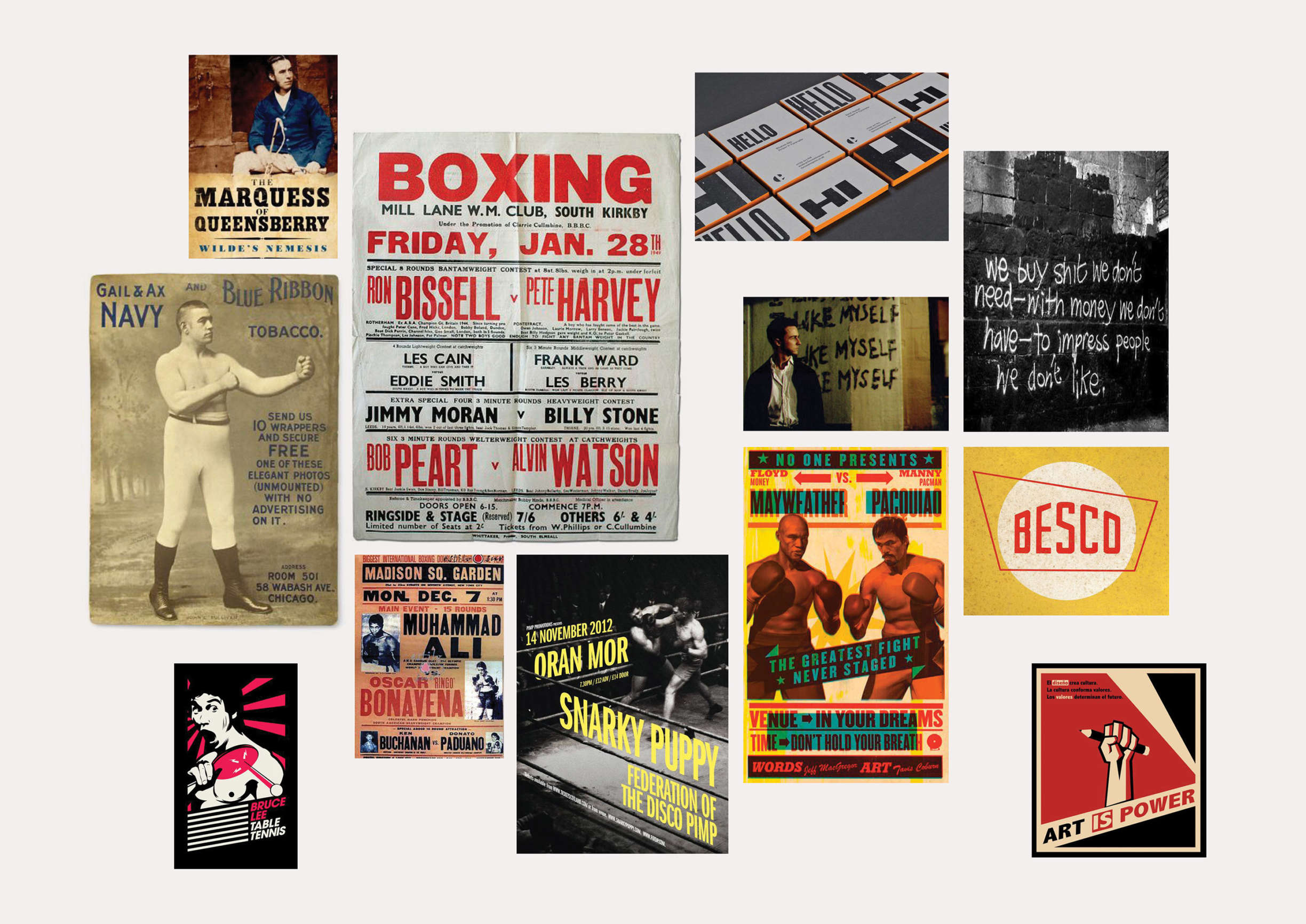
This identity needed to have an underground feel. The Queensbury Rules, vintage boxing posters and ephemera were valuable sources of inspiration, and we couldn’t shy away from ‘Fight Club’ movie connotations.
This was an opportunity to have fun with typography and texture, it could be lo-fi and gritty, a perfect antidote to corporate cleanliness.
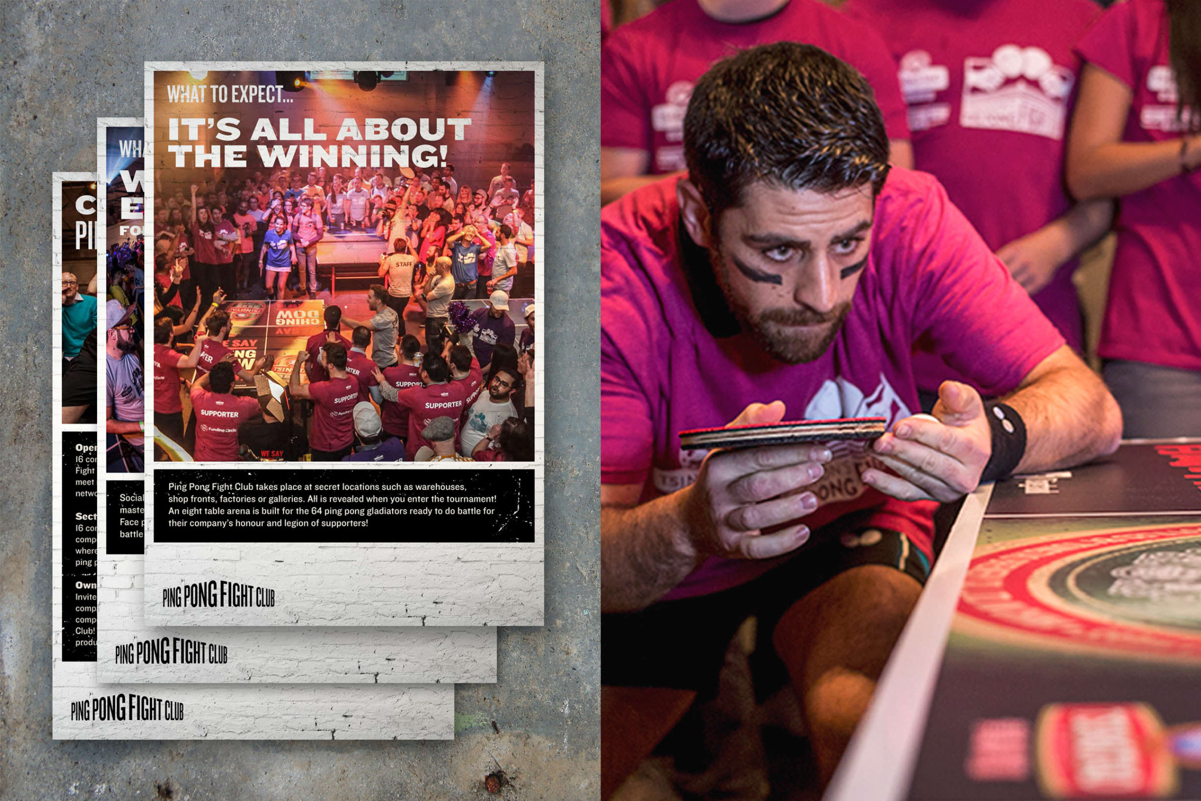
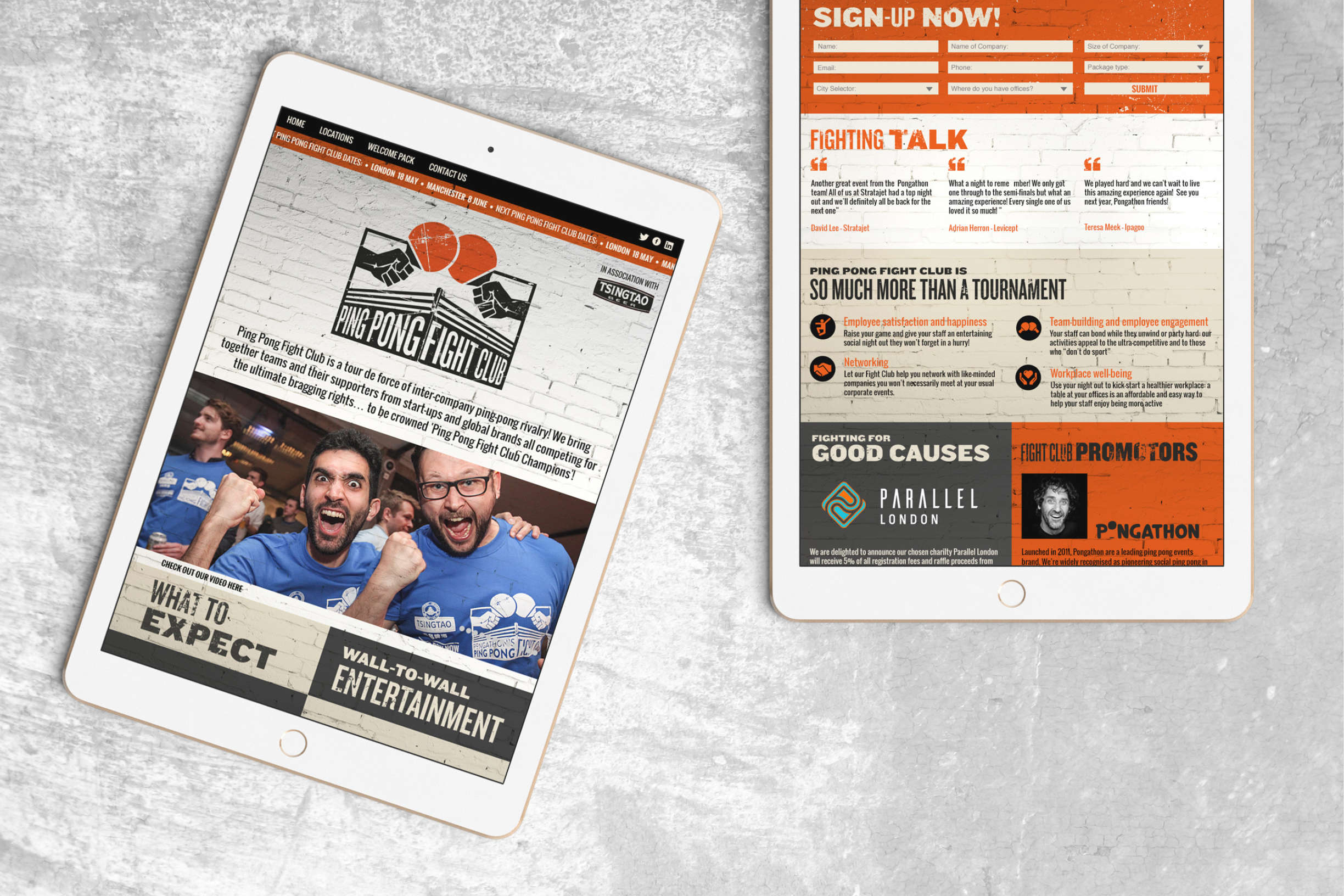
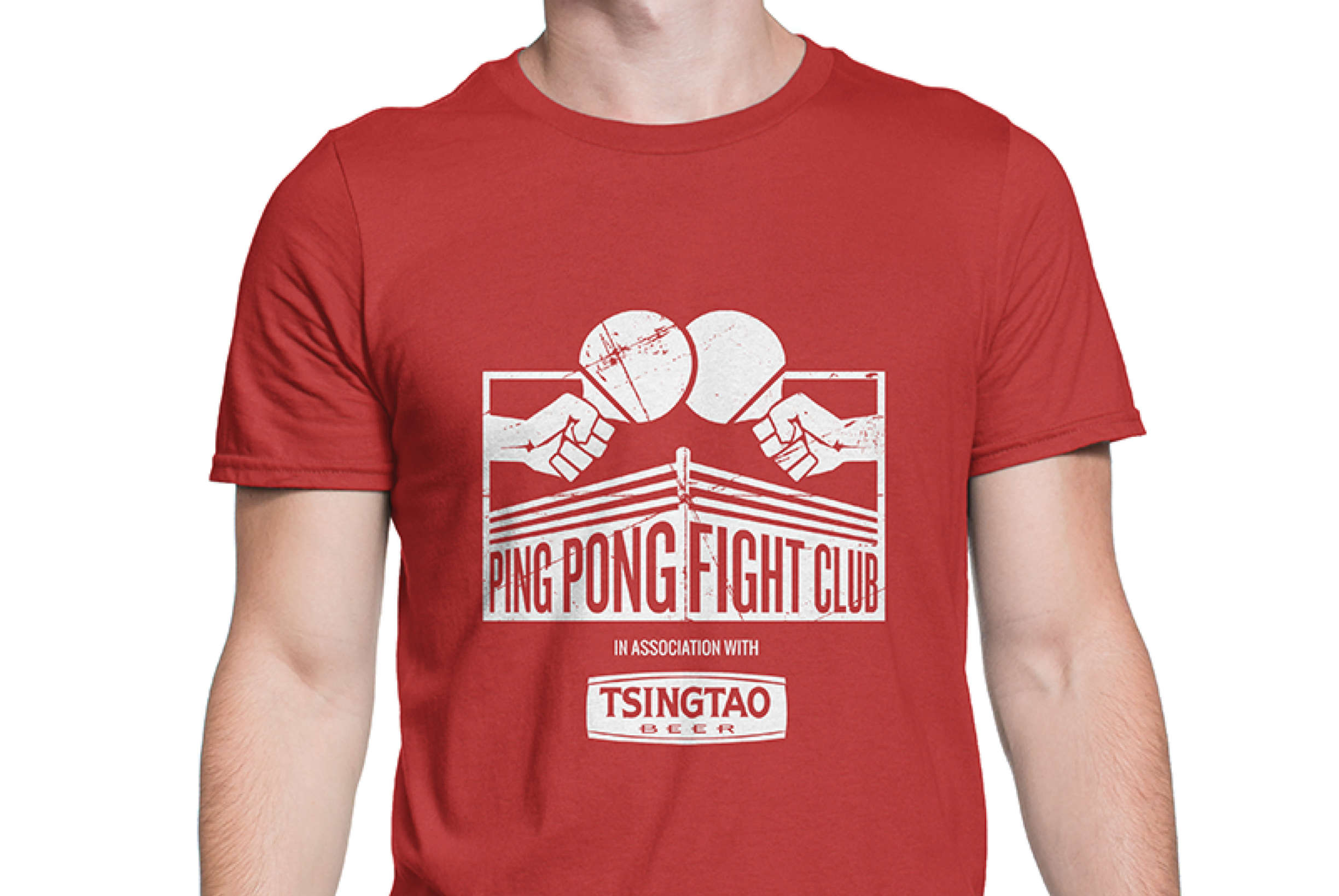
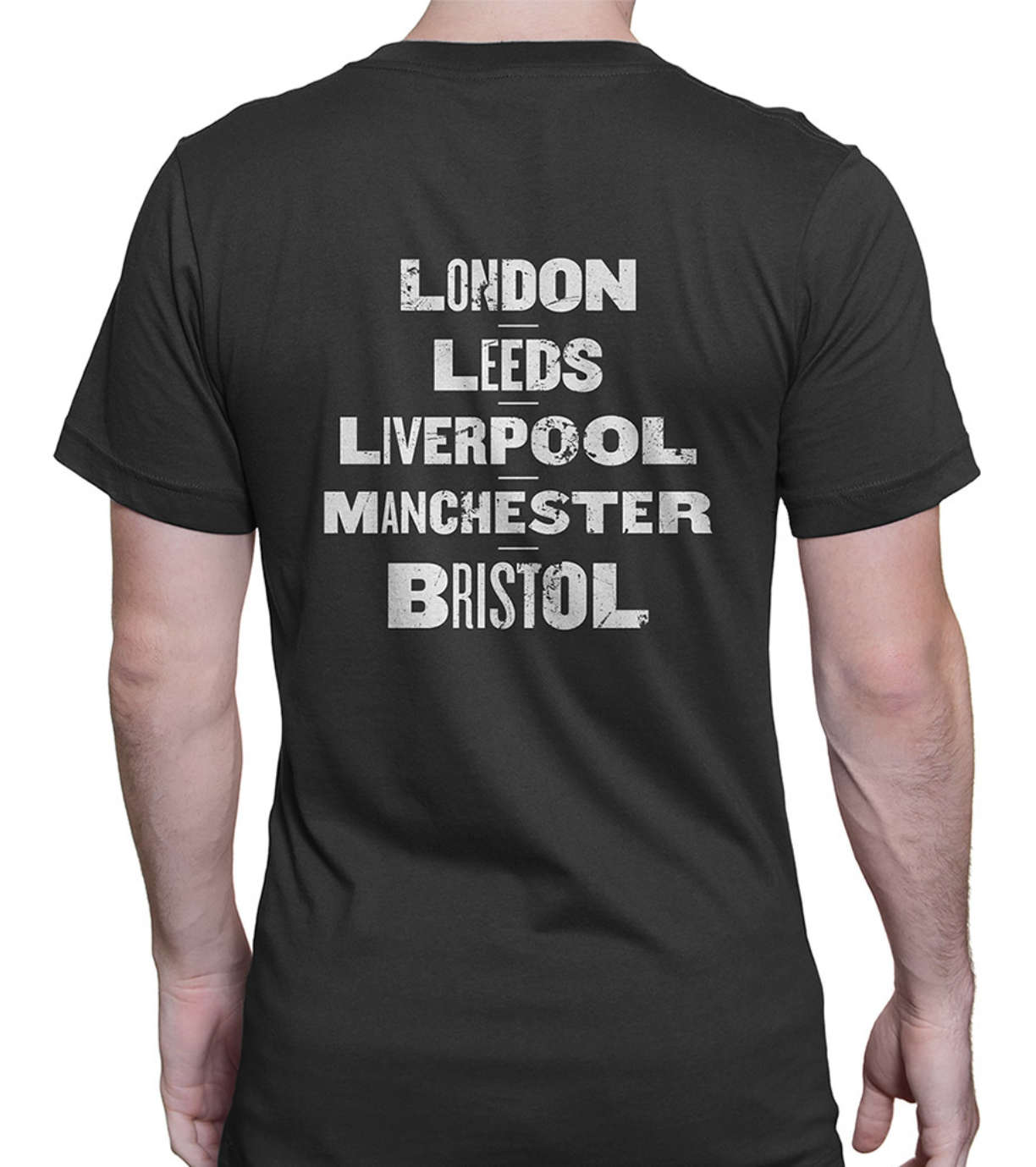
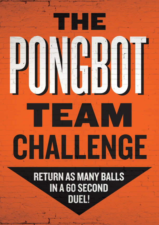
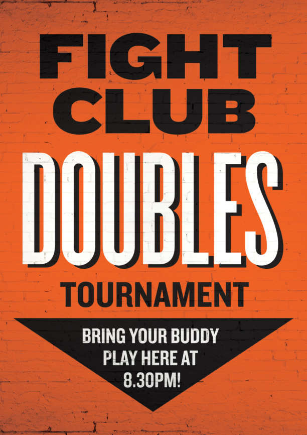
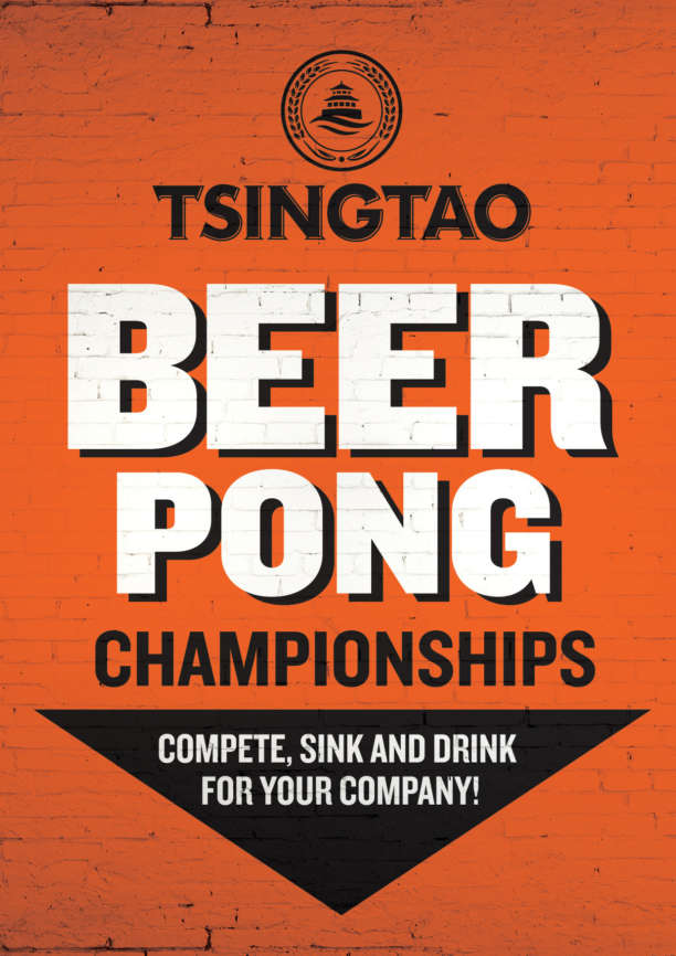
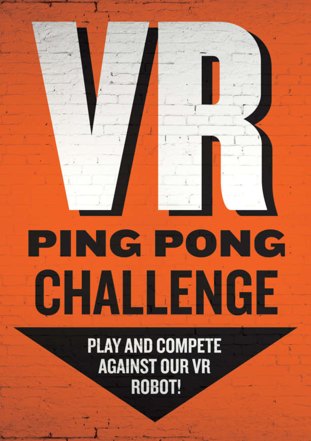
The logo and kit of parts are applied to posters website, social media and downloadable info packs plus all the event requirements such as team t‑shirts, sweatbands, projections, backdrops and score boards. PPFC trust me to continually evolve their identity responding to market changes as each tournament goes by.
