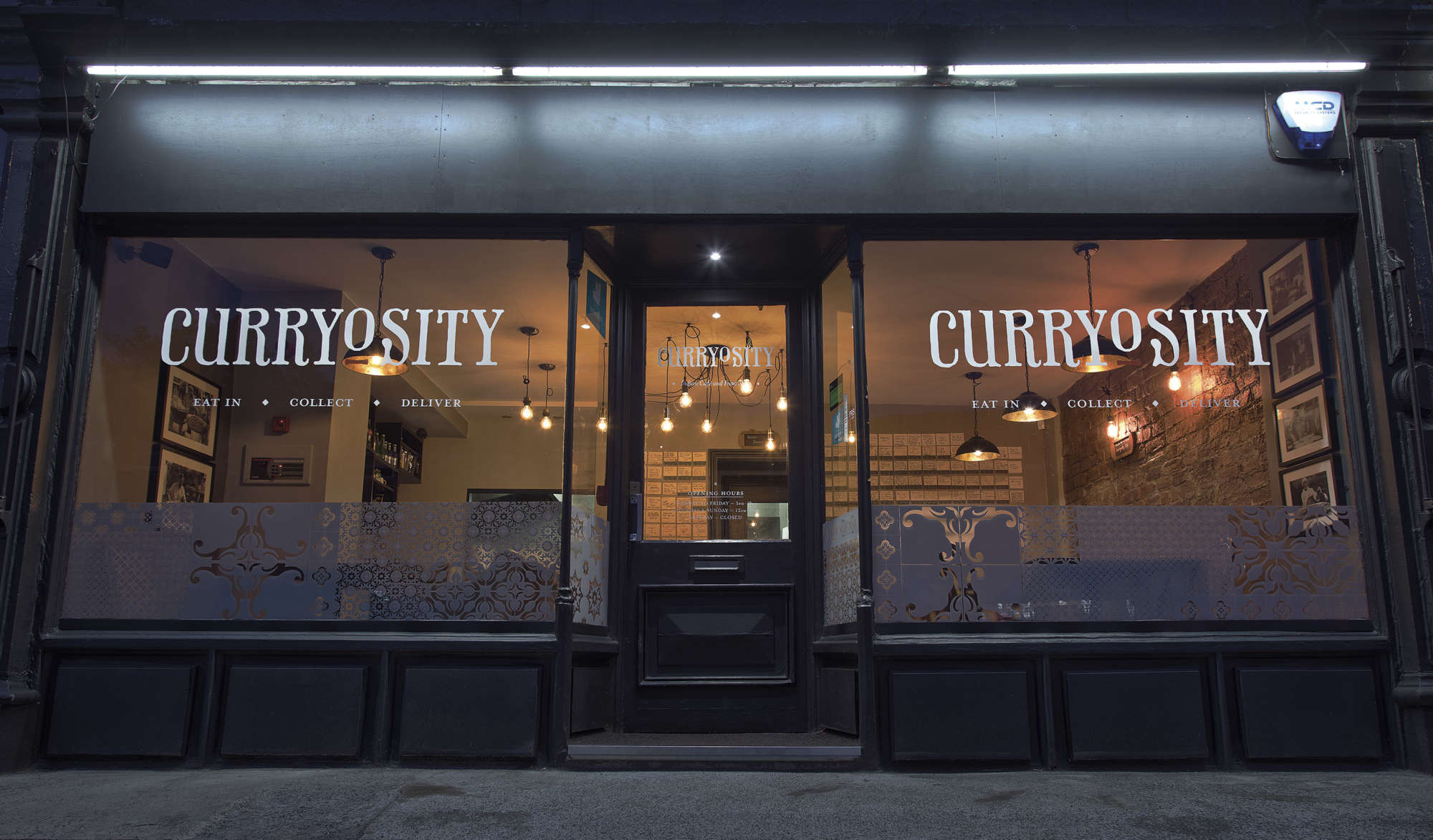
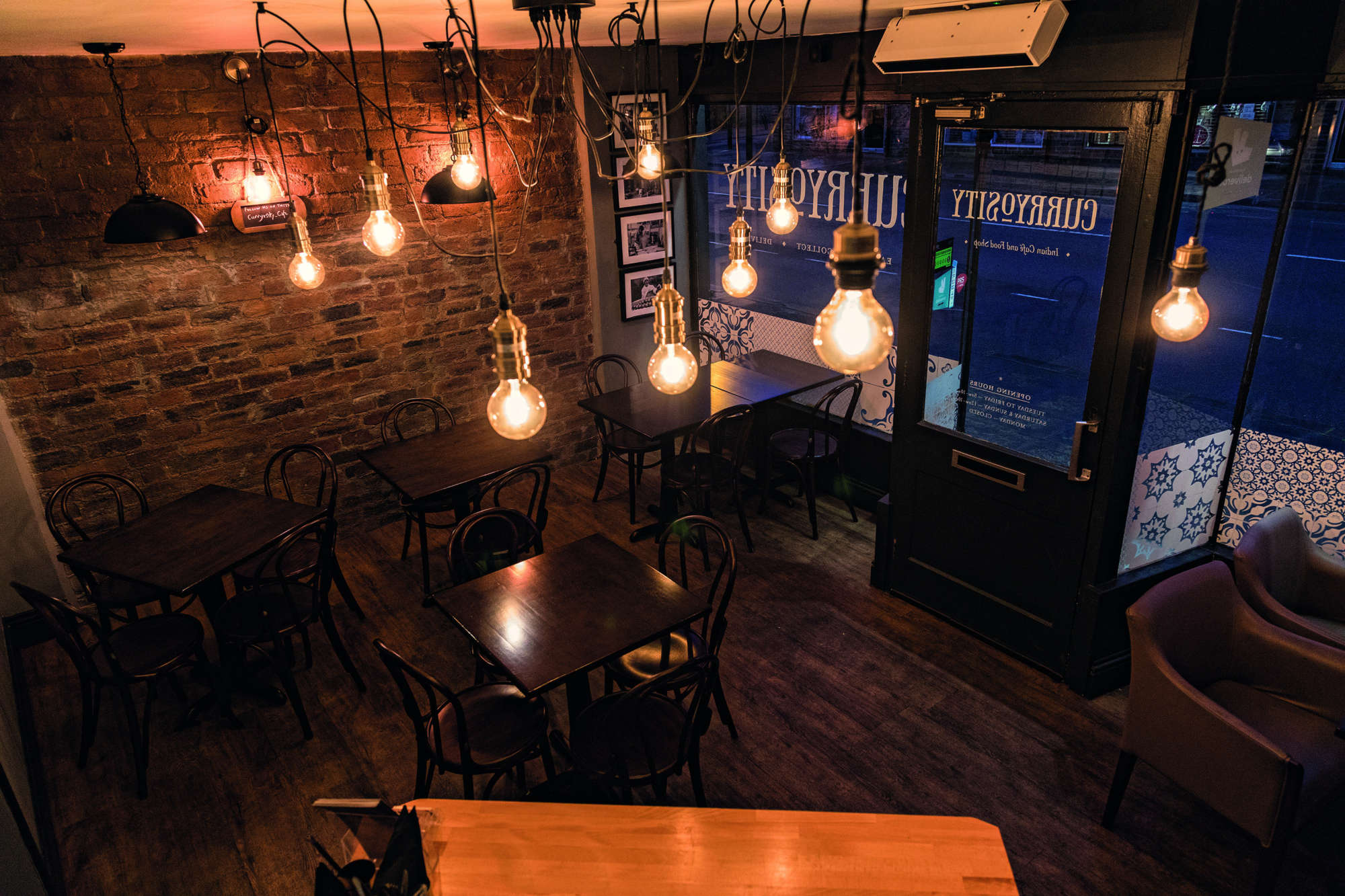
Curryosity
Indian Café and Food Shop in the heart of the UNESCO World Heritage site of Saltaire, West Yorkshire.
When the good folks from the World Curry Festival decided to branch out and start their own restaurant they called on me to create their logo and identity system.
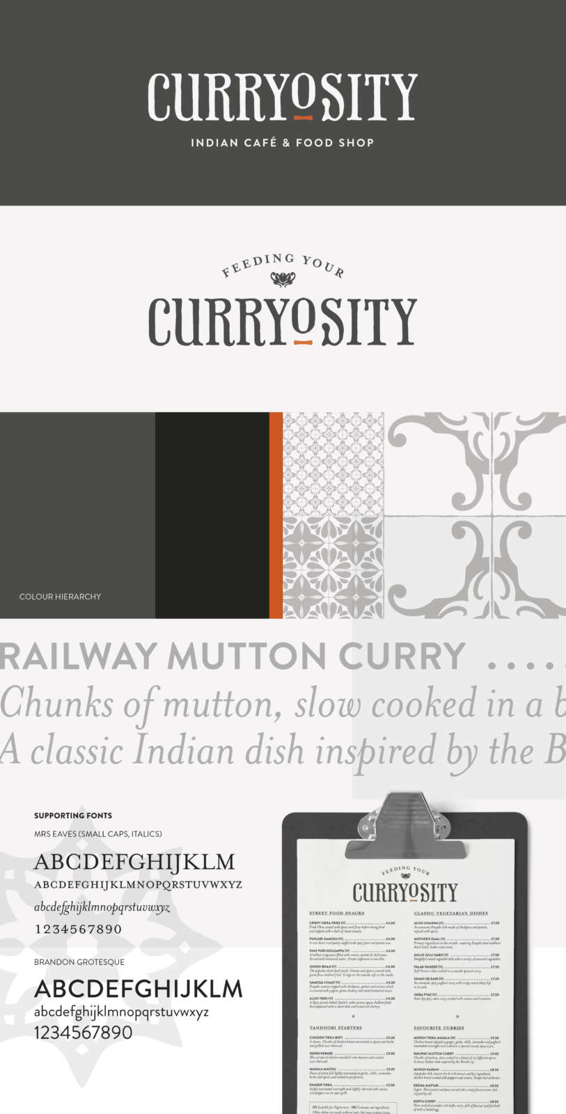
Playing on the word ‘Curiosity’ the final identity uses the Pheaton font. For me it evokes a modern take on a Victorian curiosity shop which sits well within Saltaire’s Victorian history and architecture. The almost monochrome colour scheme and traditional supporting fonts create an understated tone of voice that compliments the slightly finer dining curry experience.
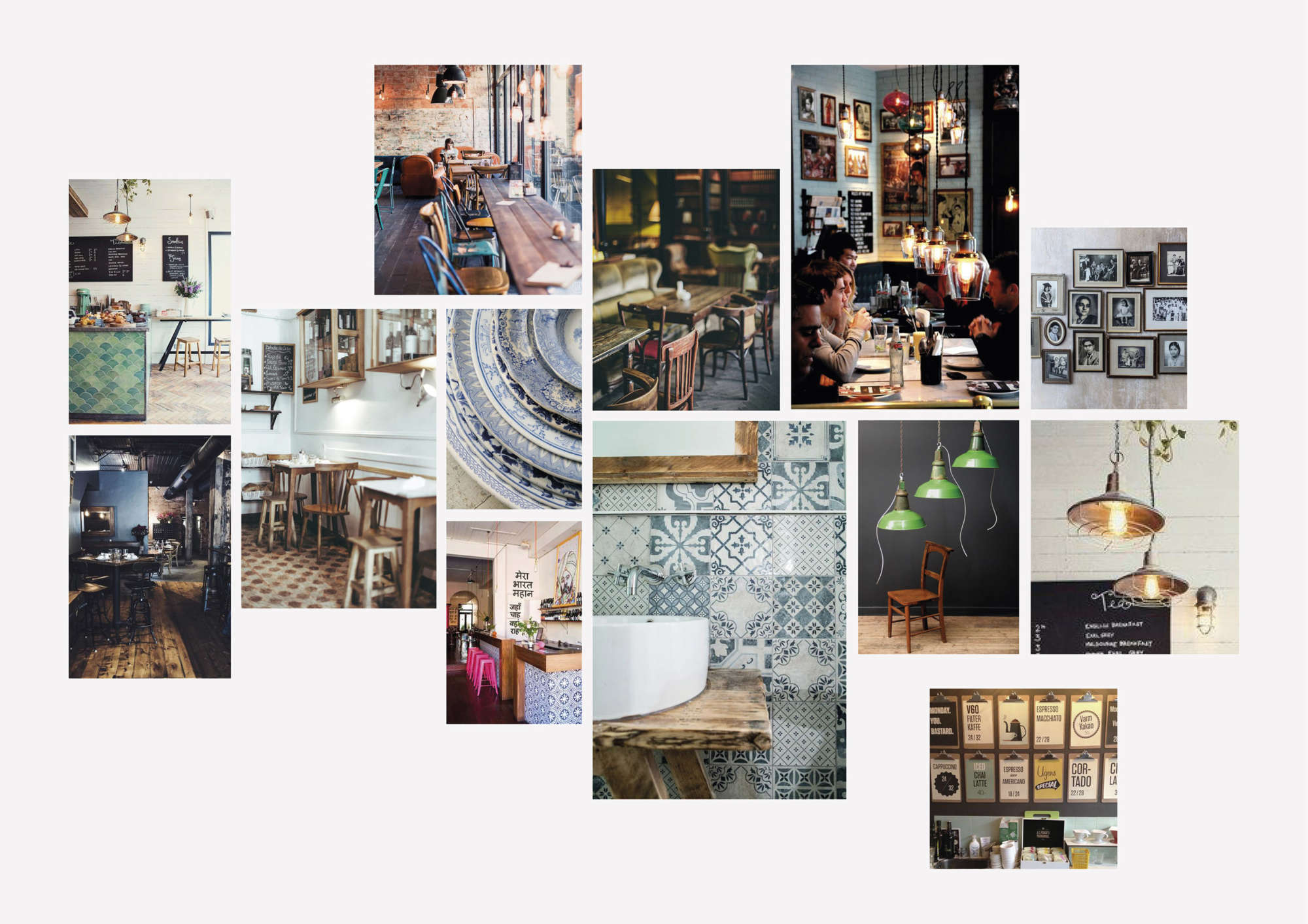
Café interior mood boards showing suggestions of lighting, furniture, photography and colour scheme.
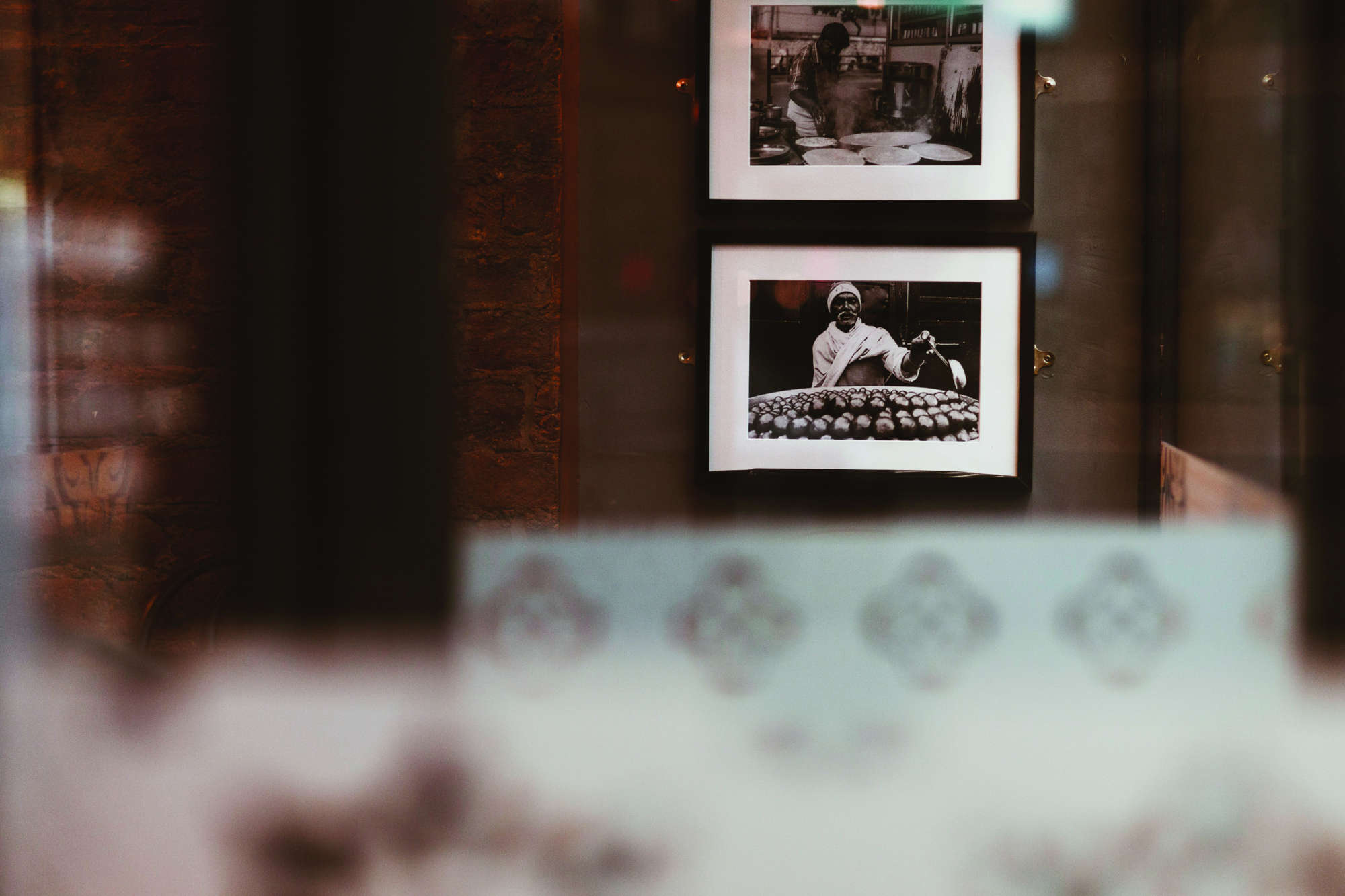
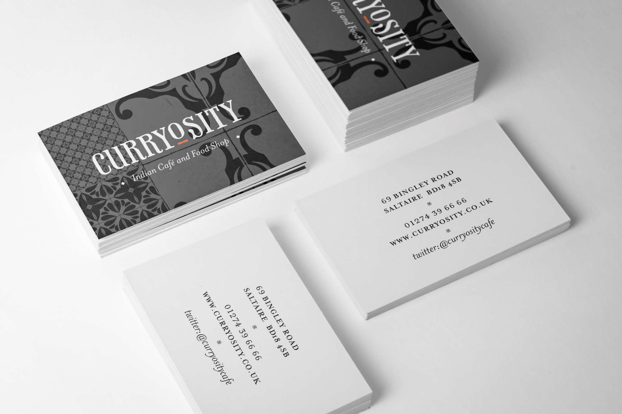
To add to the identity’s assets I used vintage tile vectors. Infinitum number of compositions can be arranged creating a unique pattern for each piece of collateral. The tiles are a nod to the Irani café’s found in India.
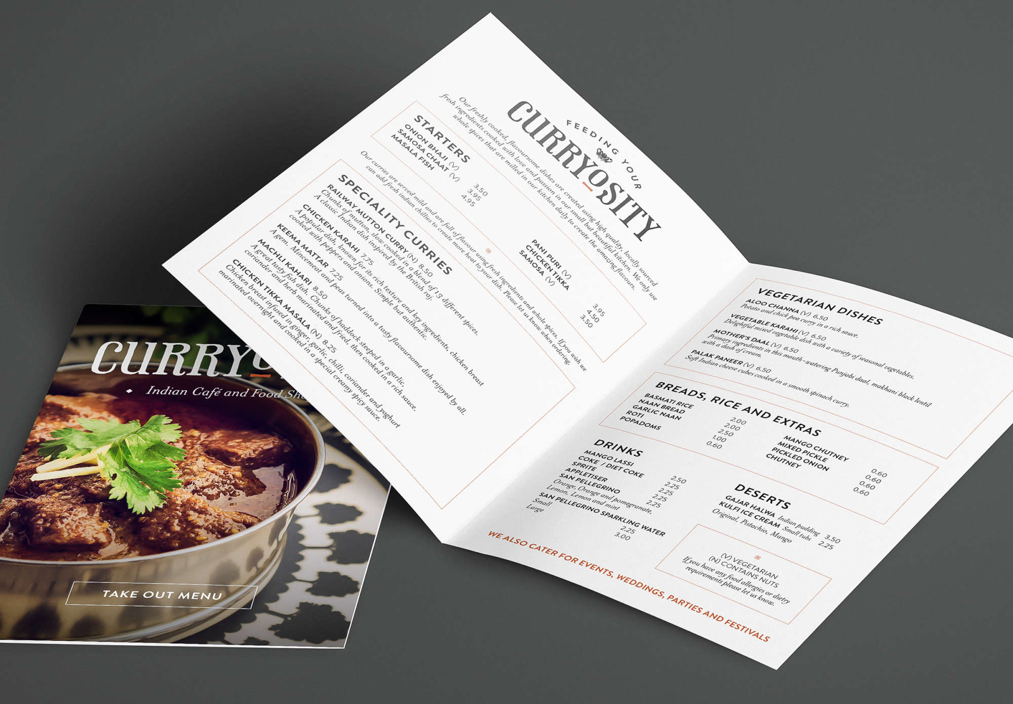
Application so far includes shop front, menus, stationery, leaflets, website and social media. As this start-up business grows the identity grows with it.