Greener Girlington
Greener Girlington is a community based programme developed by Well Bradford, part of the Bradford Teaching Hospitals NHS Foundation Trust which helps to create and enhance existing outdoor spaces and facilities available in Girlington.
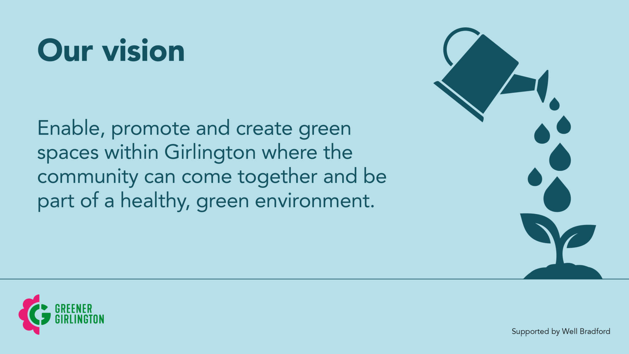
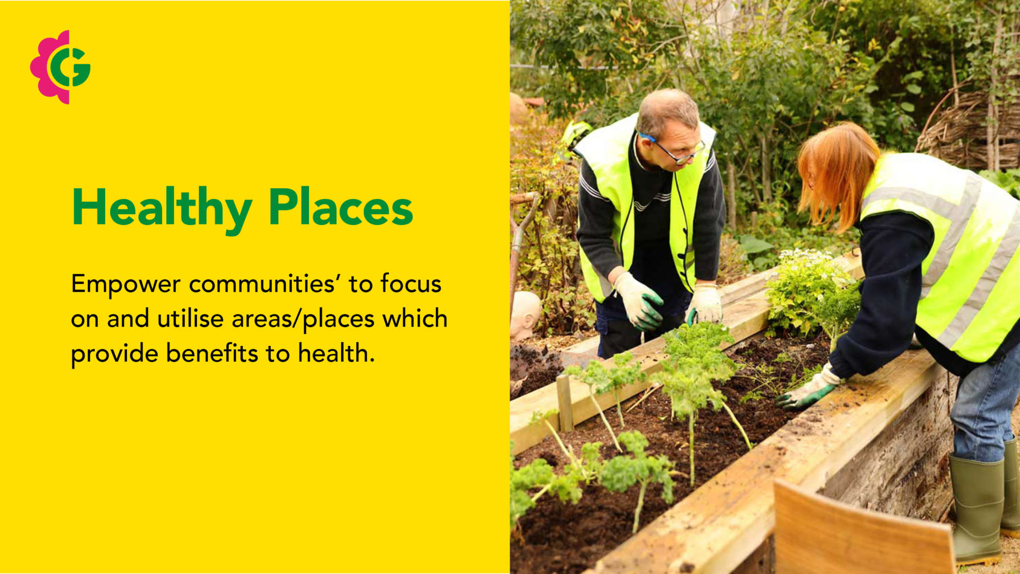
Girlington is an area of Bradford that has sadly slipped into deprivation. Greener Girlington’s vision is to clean-up and create green spaces within the Girlington area. By doing this they hope to engage, educate and encourage the community to take ownership of these spaces which in turn improves their health and mental wellbeing.
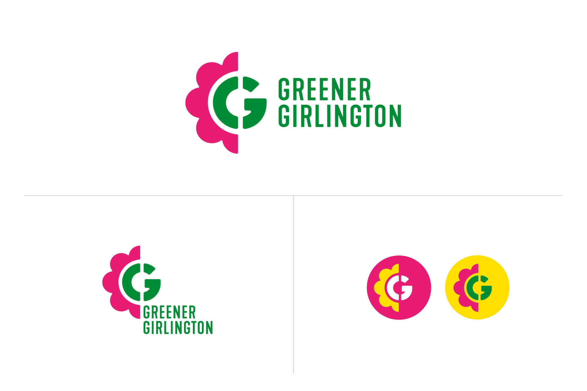
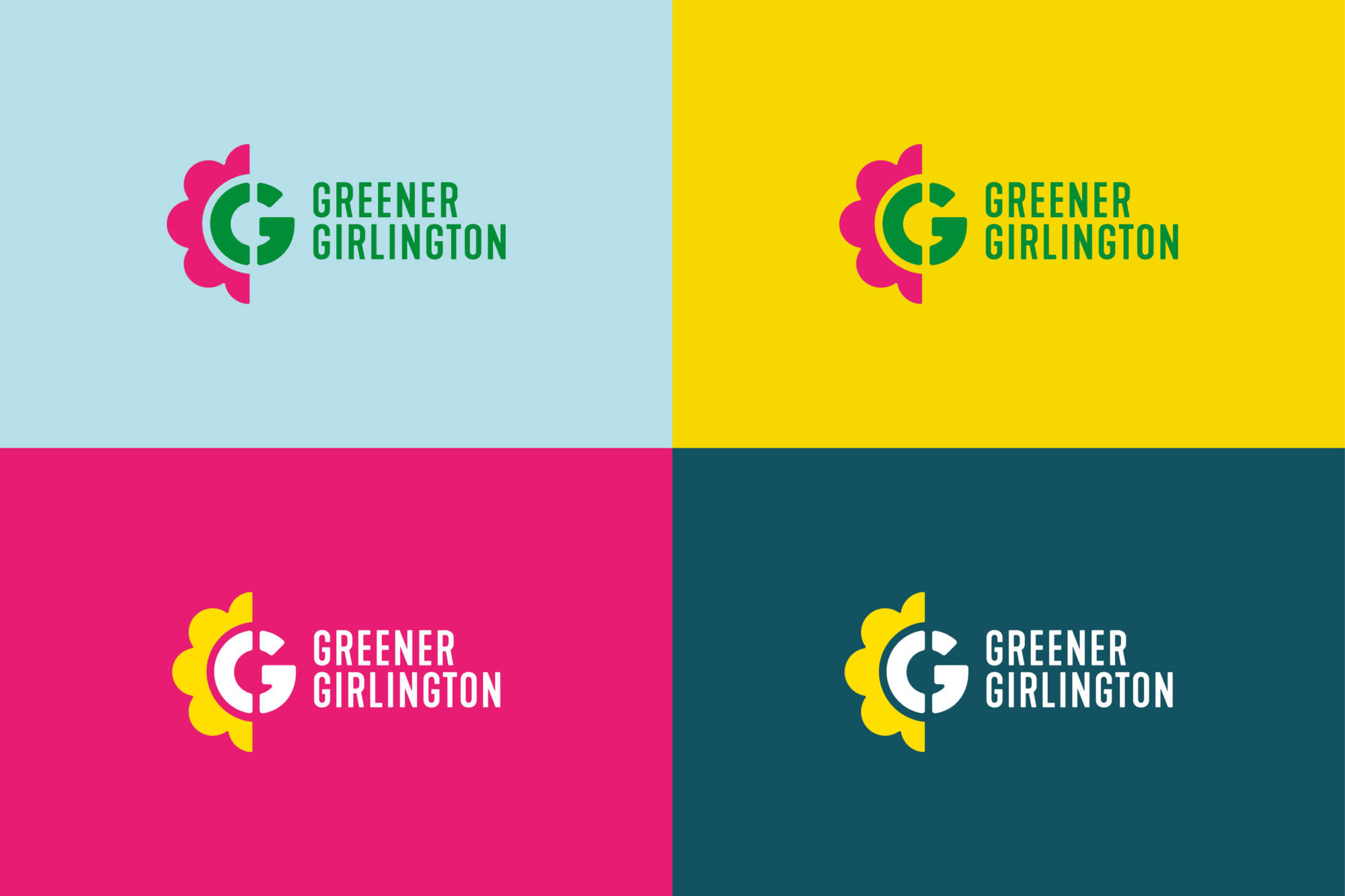
The Stencil capital G evokes an urban feel representing the Girlington area. The half flower is a symbol of making things better and brighter. A strong graphic means the Greener Girlington text can afford to sit back and let the symbol do the work.

In addition a multi-icon G was created. Each icon represents the many positive benefits of the Greener Girlington initiative – from health and well-being to flora and fauna – all neatly arranged to sit within the capital G shape.
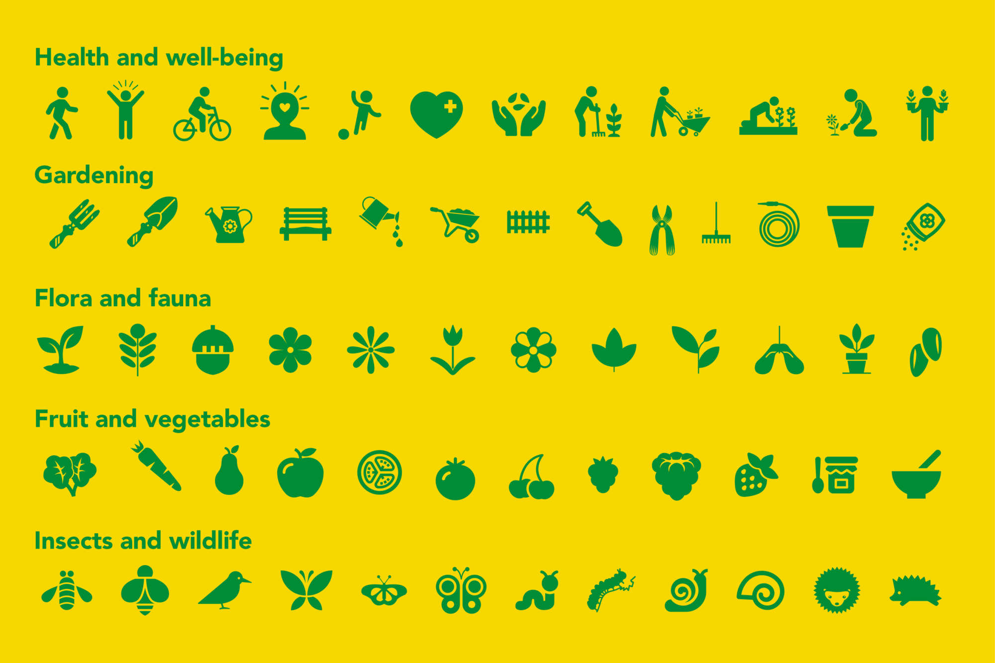
Once the identity has been designed there comes the very important handover stage. I knew from the very beginning this identity needed to be simple enough for non-designers to use within the Microsoft suite of software. As well as 65 icons each in the seven colours of the brand palette, I supplied visual guidelines with instructions on how best to use and combine all the assets to create a coherent and consistent visual identity across all media.